
Urban Niche Co. — Where Modern Aesthetics Meet Business Goals
The objective is to create a user experience that effectively supports both brand identity and business growth in the highly competitive marketing services industry.
DM Sans / Lato
Cyan (Process) / Congo Pink
Marketing Agency
Figma
Objectives
The Urban Niche Co. website was designed to create a bold first impression with modern visuals and clear messaging. A funnel-based layout and repeated CTAs guide users smoothly from awareness to action. High contrast, responsive grids, and mobile-first elements ensure clarity and usability across devices. Trust is built through team visuals, testimonials, and clean, benefit-driven content. Promotional products are integrated seamlessly, and brand personality shines through soft shapes, geometric motifs, and a vibrant color palette. Accessibility and conversion remain central to the overall UX strategy.
Detailed Objectives
1. Strategic First Impression
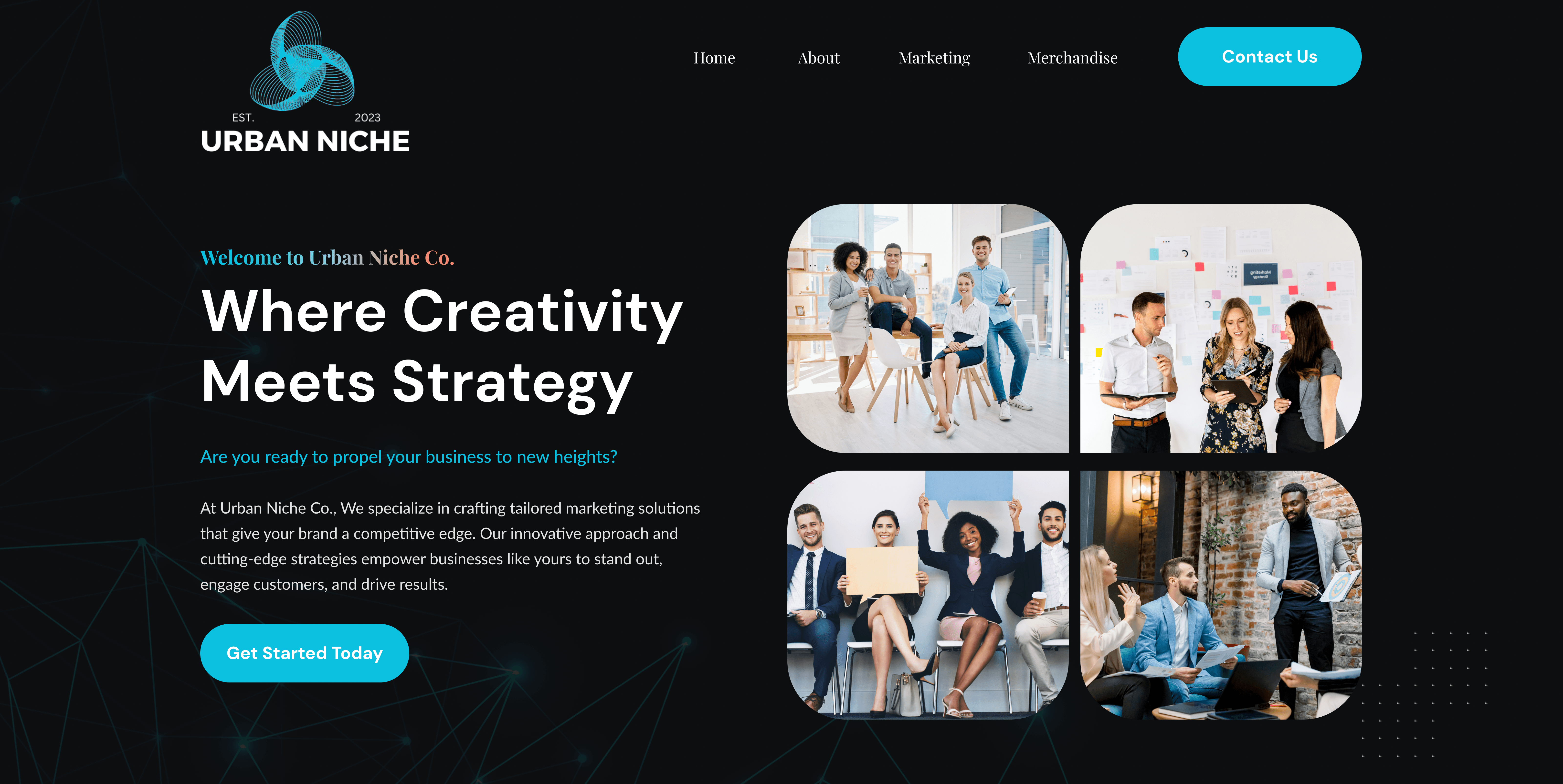
Tagline “Where Creativity Meets Strategy” quickly communicates brand positioning.
Use of bold typography and dynamic visuals reinforces a high-energy, modern agency vibe.
Rounded image tiles in the hero area convey diversity, creativity, and approachability.
2. Clear Navigation & Funnel-Based Flow
Sticky top navigation and a prominent “Contact Us” CTA in bright blue guide users toward action.
Sections follow a logical funnel: awareness → services → trust-building → action.
3. Contrast & Visual Hierarchy
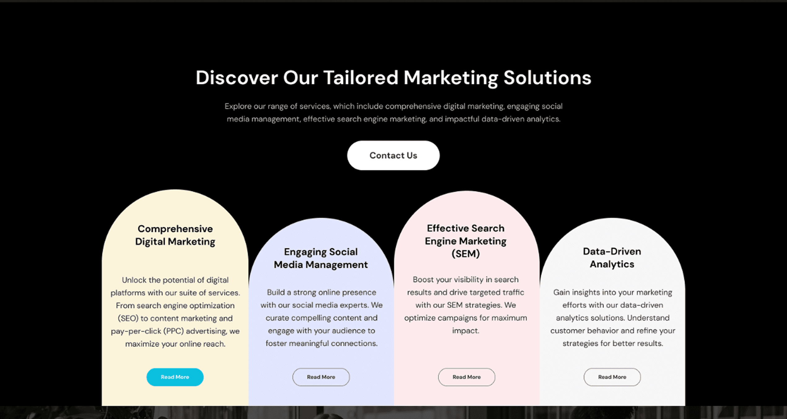
Dark background contrasts sharply with white/light content blocks and neon-blue CTAs.
Key headlines use color highlights and font weight to draw the eye.
Buttons are consistently styled to ensure predictability and usability.
4. Mobile-First & Responsive Structure
Grid layout with flexible, stackable cards ensures responsive behavior.
Rounded tiles, simple icons, and legible text adapt seamlessly to small screens.
5. Trust-Building Elements
Photos of team members and testimonials (“We’ve been there, done that”) add human connection.
Use of icons for values like “Expertise,” “Collaboration,” and “Results” build brand trust.
6. Product Promotion with Seamless UX
Mid-page “Promotional Products” section feels integrated, not interruptive.
Smooth transitions between marketing services and merchandise offering support cross-selling.
7. Clarity in Messaging
Copy is concise and benefit-driven: “Empowering Businesses to Shine,” “Tailored Marketing Solutions.”
Minimal jargon ensures accessibility for a broad audience, including small business owners.
8. Repetition of CTA = Increased Conversions
“Contact Us” CTA is repeated in multiple sections, reducing friction and increasing opportunity for engagement.
Each section closes with a compelling reason to take action.
9. Visual Motifs & Brand Identity
Geometric, abstract background graphics add depth and brand personality without being distracting.
Rounded corners and soft color palettes create a friendly, modern, and creative impression.
10. Accessibility & Readability
Large, clear typography contrasts well against backgrounds.
Buttons are large enough for mobile tapping and color-coded for immediate recognition.



Conclusion
We focused on crafting a user experience that:
Feels professional yet creative
Seamlessly guides users to action
Builds trust and credibility
Adapts beautifully across devices