
Flirt, Play, Repeat: UI Design That Sparks Desire
A vibrant, playful website designed to promote intimacy and connection through an adult card game. Bold visuals, cheeky copy, and clear UX make the experience fun, inclusive, and easy to explore. The design encourages curiosity while guiding users smoothly from discovery to play.

Vartek
Fun, Cheeky, and Casual
Lifestyle & Intimacy
Figma / Photoshop
Core Offerings
Base card game with sensual and flirtatious prompts
Booster and expansion packs for new themes and kink levels
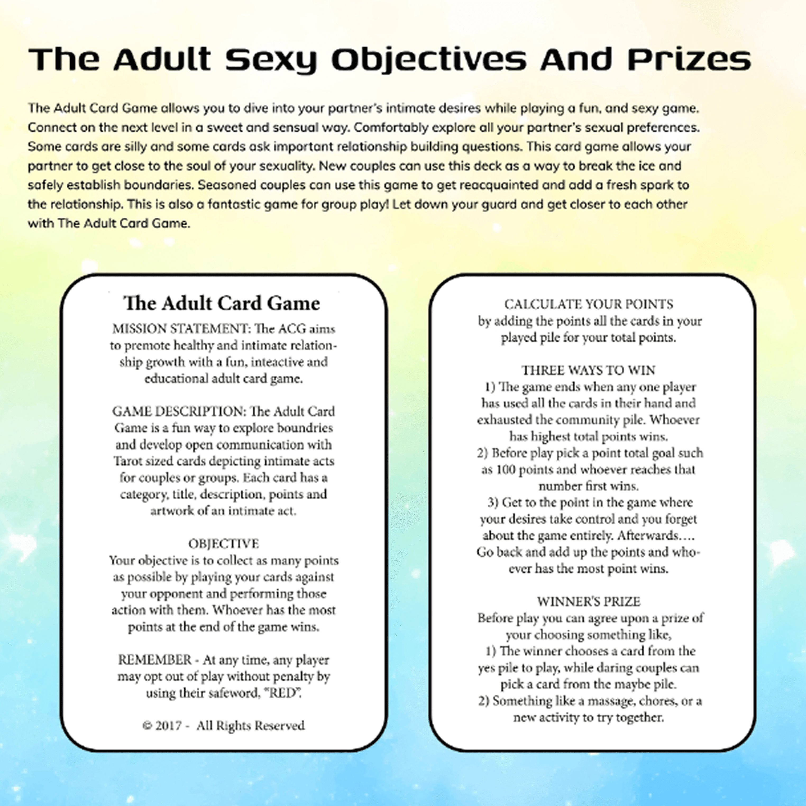
Play modes with objectives, prizes, and boundaries
Options for in-person and potentially digital play
Audience
Romantic partners (couples, especially long-term)
Adults exploring intimacy in a safe, consensual setting
Gift shoppers (bachelorette parties, anniversaries, etc.)
UI/UX Design Strategy
1. Bold Visual Identity
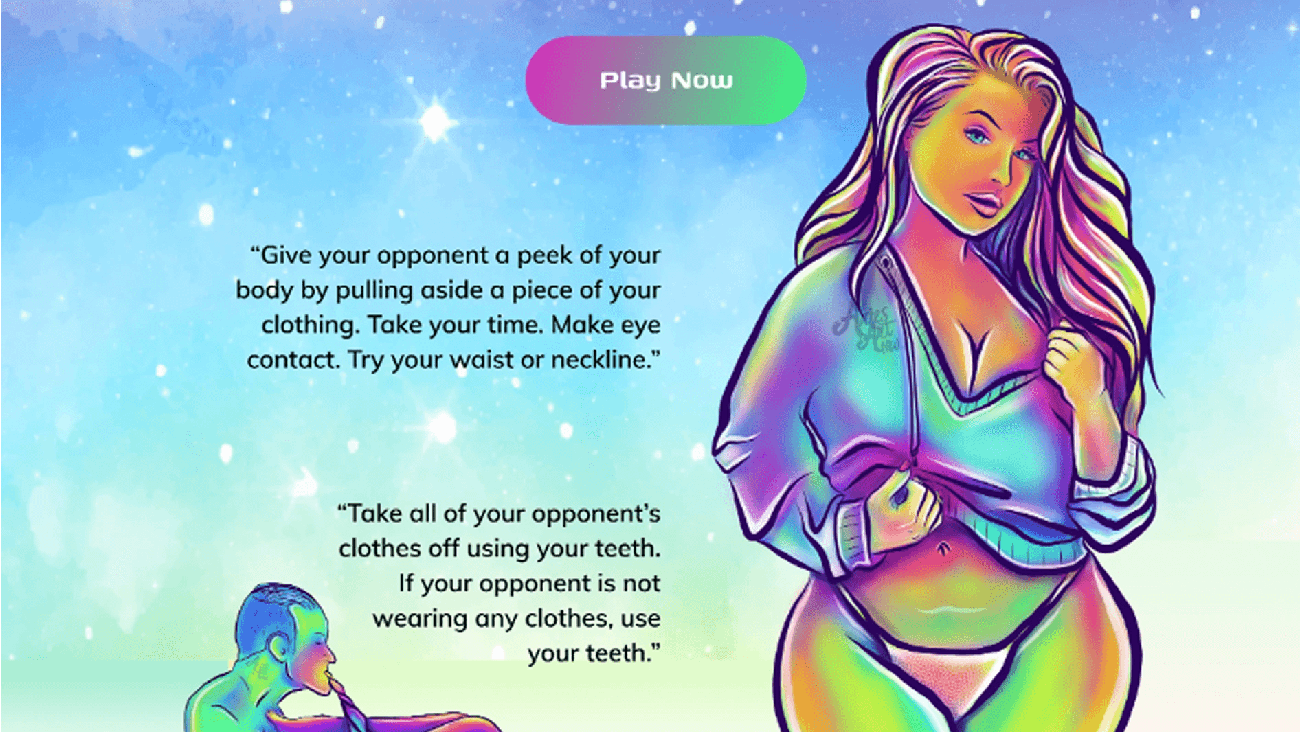
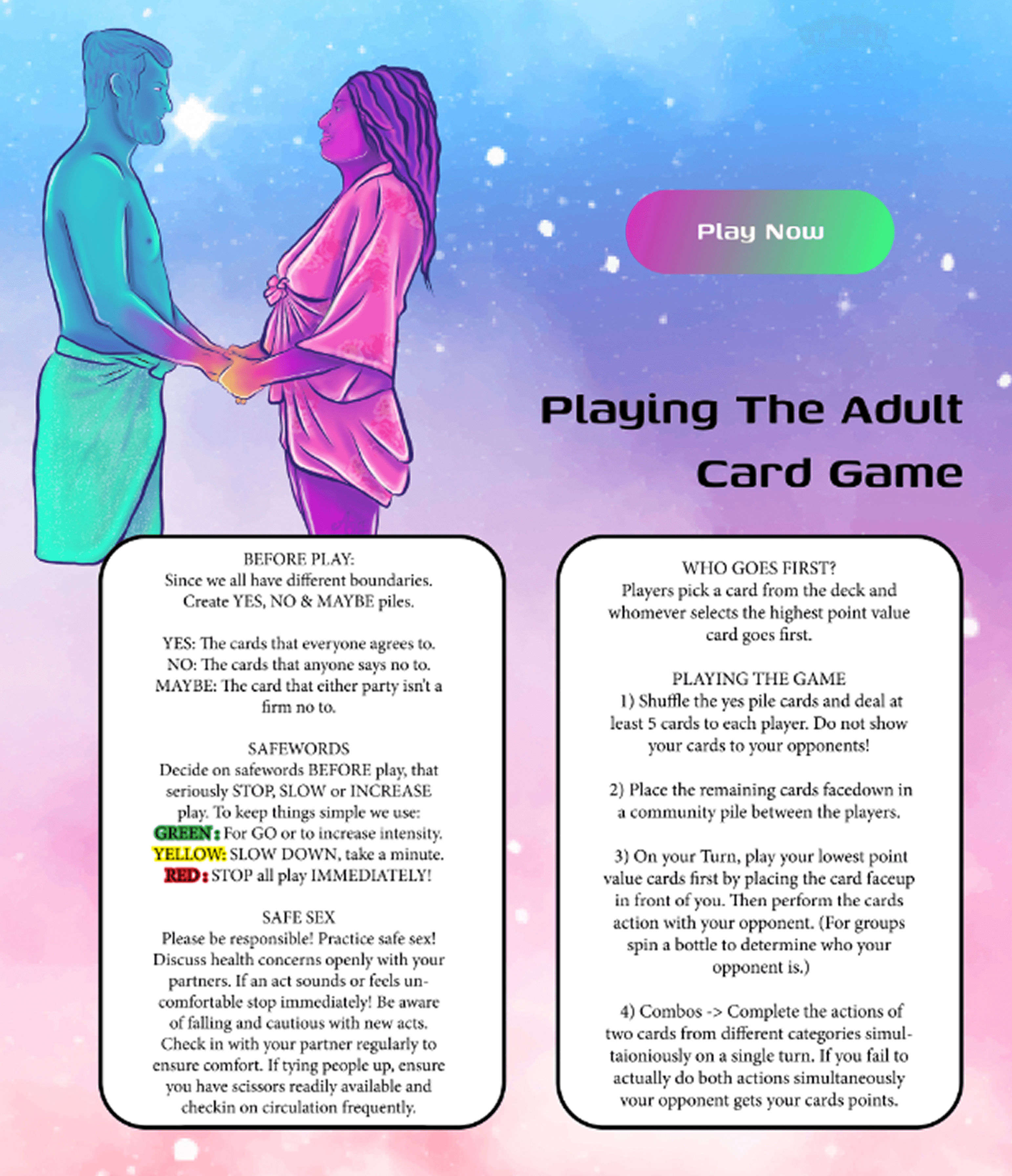
The vibrant, neon-glow rainbow gradient background creates a fantasy-like, playful vibe, evoking freedom, fun, and sexuality.
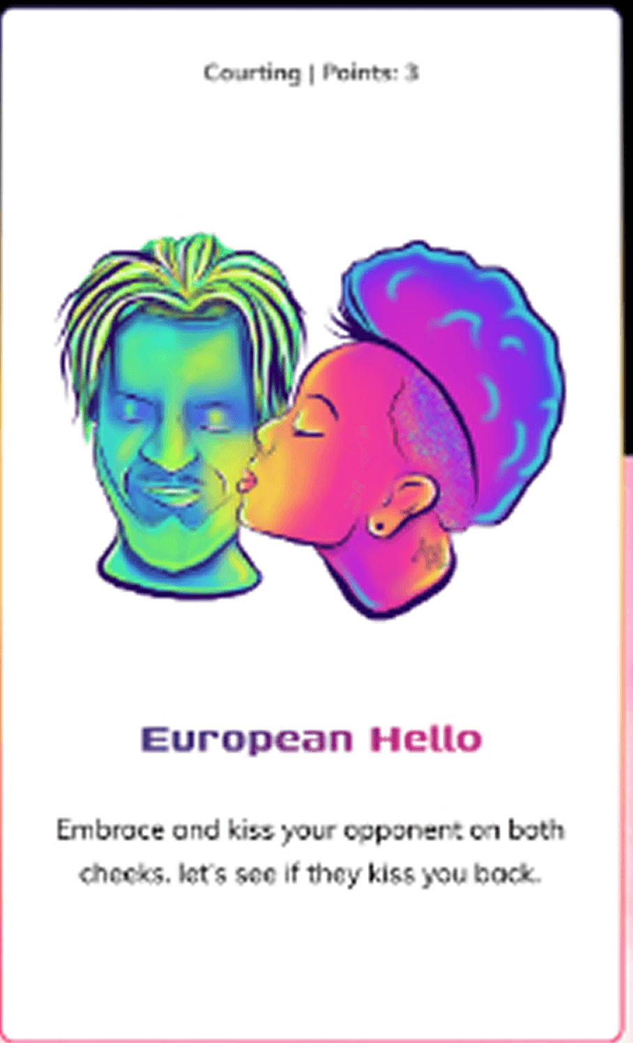
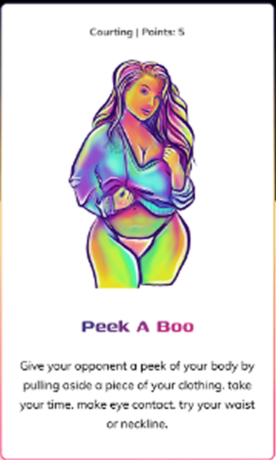
The psychedelic illustrations of characters and cards reinforce the non-traditional, expressive tone of the brand.
2. Emotional Engagement
The homepage uses flirty, direct language like “Get Closer Than Ever” and “Play Now” to appeal to the visitor's curiosity and desire.
Testimonials and previewed cards build trust and relatability, letting users envision themselves playing.
3. User Flow & Conversion Strategy
Immediate CTA: The “Play Now” button is repeated strategically across the page.
Simple email capture for expansion pack updates and future engagement.
Visually highlights how to play, what’s included, and how it benefits relationships, reducing hesitation and boosting purchase intent.
4. Clear Education Before Purchase
The “How to Play” and “Set Boundaries” sections ensure the game feels consensual, respectful, and inclusive.
Descriptive cards (e.g., “Peck & Boo”, “Deep Breath”) offer a sneak peek, helping users understand what to expect and easing comfort levels.
5. Responsive, Modern Layout
The design is vertically scroll-based, optimized for mobile-first users (ideal for private viewing).
Icons, headings, and short paragraphs support readability and fast information consumption.
6. Tone of Voice
The copy is fun, cheeky, and casual, aligning with a brand that wants to feel approachable, not clinical.
Sentences like “Do a seductive dance on or around your opponent” keep it light yet enticing.




Conclusion
The Adult Card Game website is a bold fusion of fun, intimacy, and modern UX strategy. Through its psychedelic visuals, emotionally engaging content, and clear play instructions, the design builds trust, intrigue, and desire, encouraging users to explore and eventually buy. It manages to present a mature product in a way that feels inclusive, respectful, and exciting — perfect for a modern adult audience looking to reconnect or explore intimacy playfully.