
A Bold Digital Identity for a Results-Driven Marketing Agency
Understanding the Basics
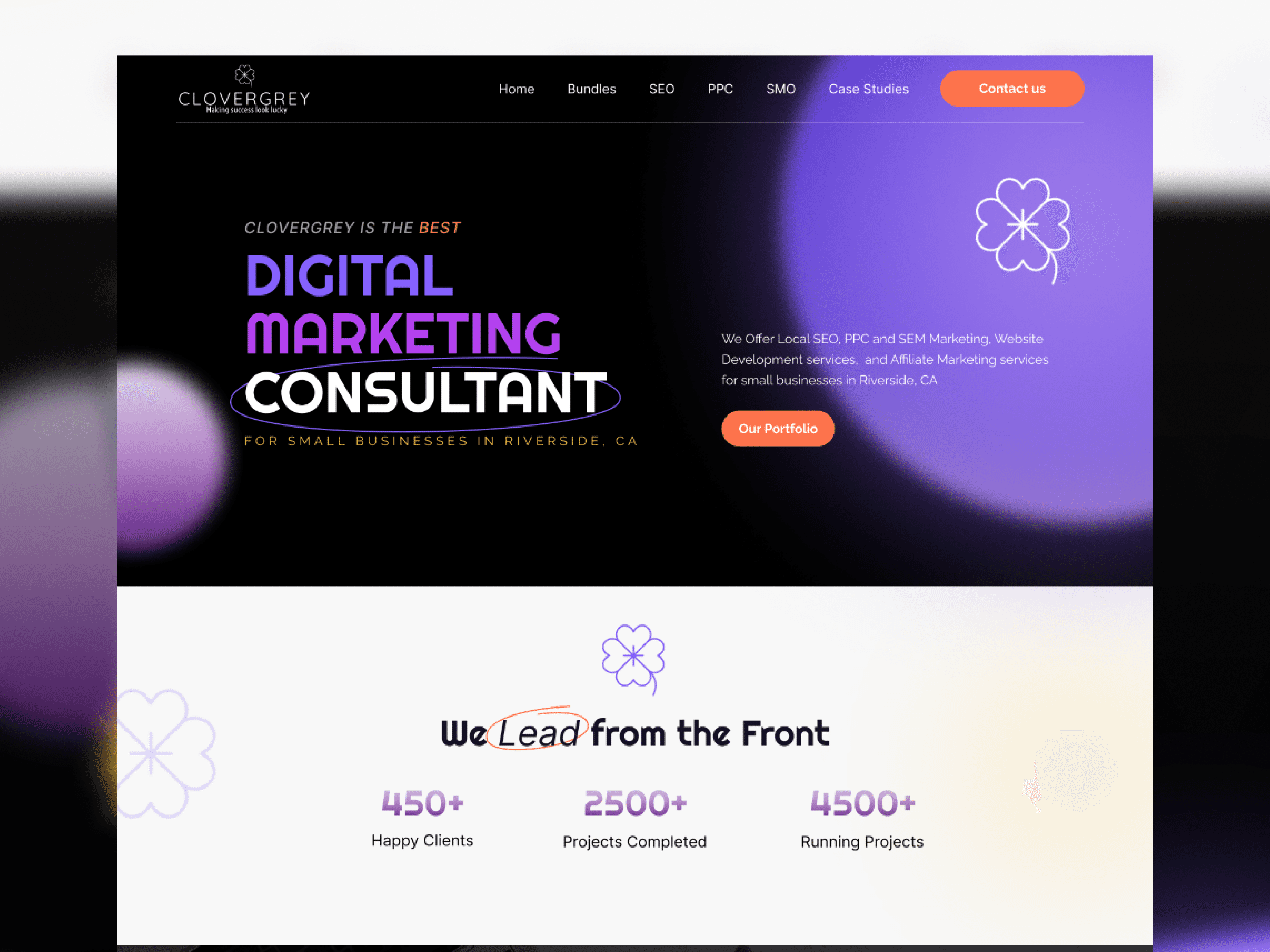
The design is rooted in aligning visual clarity, usability, and brand positioning. Every element—from layout to language - works together to create a seamless, trustworthy, and goal-driven user experience that supports both brand building and business outcomes.
Real-World Application with Case Studies
Industry-Specific Examples: Highlighting case studies across Freight, Real Estate, and Restoration provides practical proof of work and resonates with potential B2B clients.
Interactive Cards: Color-coded visual boxes make the section engaging and help differentiate services.
Key Design Focus Areas:
High-Impact Visual Style:
Dark theme with electric purples and gradients creates a modern, tech-forward aesthetic.
Bold typography and color contrast command attention and reflect confidence.
Conversion Optimization:
Strategically placed call-to-action buttons like "Contact Us" and "Book a Free Consultation" appear throughout the page to drive inquiries.
Highlights credibility with client stats, service badges, and case studies to reduce decision friction.
Clear Service Communication:
Breaks down offerings into SEO, PPC, SMO, etc., with simple language and icons, making services easy to understand for non-technical audiences.
Uses real-world examples (case studies) to build trust and relevance.
Strategic Layout & Flow:
Follows a storytelling structure - from problem-solving intro → proof of experience → service breakdown → consultation offer.
Each section leads smoothly to the next, guiding the visitor through the sales funnel.
Conclusion
The website delivers a seamless user experience that’s both visually compelling and conversion-focused. Every design choice - from the dark, modern aesthetic to the approachable tone and structured layout—works together to build trust, simplify decision-making, and position the brand as a confident, reliable partner for growing businesses.