
ClickSense Website Redesign: Driving Trust, Clarity, and Conversions
The layout is clean, professional, and intentionally segmented to enable quick scanning, build trust, and ensure effortless navigation.
Work Sans
Vivid Cerulean / Rich Black
Marketing Consultant
Figma
UI/UX Summary
UX Objective | UI Solution |
|---|---|
Build trust quickly | Brand logos, stats, authentic photography |
Increase consultation bookings | Prominent CTAs, clear steps, and repeated call-to-actions |
Simplify content consumption | Modular cards, bullet points, short paragraphs |
Keep users engaged | Visual rhythm via color, imagery, and layout variation |
Guide user journey effectively | Clear navigation and visual hierarchy |
UX Architecture
Key UI/UX Design Principles Applied
1. Hero Section with Strong Value Proposition
Bold headline (“Practical Strategies to Achieve Your SEO Goals”) immediately communicates the brand’s offering.
Includes primary CTA ("Book a Free Consultation") placed prominently above the fold to encourage immediate action.
Human-centric image with collaborative workspace visuals evokes trust and professionalism.
2. Social Proof and Client Trust
Logos of known brands (Dribbble, Behance, Yahoo!, Netflix) displayed early on to establish credibility and perceived authority.
Statistic highlight (“40,000+ customers”) adds quantifiable trust signals.
3. Process Clarity
“Our Process” section visually breaks down the company's workflow (Audit → Strategy → Link Building).
Card-based UI provides digestible content chunks and encourages deeper exploration via “Read More” buttons.
4. Sectional Contrast for Engagement
Use of color contrast (white → dark blue → light blue) separates content sections and maintains visual interest.
Dark section (“Optimized to the Unique Needs...”) highlights services distinctly, drawing attention with bold typography and data visuals.
5. Encouraging Action through Repetition
CTAs such as “Book a Free Consultation” are repeated strategically in multiple sections.
Use of rounded buttons with bold color (blue/yellow) aids CTA visibility and clickability.
6. Data-Driven Storytelling
“Powering Progress with Data-Driven SEO Strategies” segment aligns the company’s methods with business intelligence.
Bullet points like “Keyword Precision” and “Market Fit” deliver informational clarity for decision-makers.
7. Performance Metrics
Simple metric cards (“Transparency”, “Strategic Refinement”) use icons + headlines to quickly communicate benefits.
Helps users associate SEO with measurable ROI—essential for B2B conversion.
8. Case Studies and Testimonials
Visuals and content are presented in authentic, work-related contexts.
Builds narrative proof that the strategies actually work (“Transforming Vision into Action”).
9. Business Approach Summary
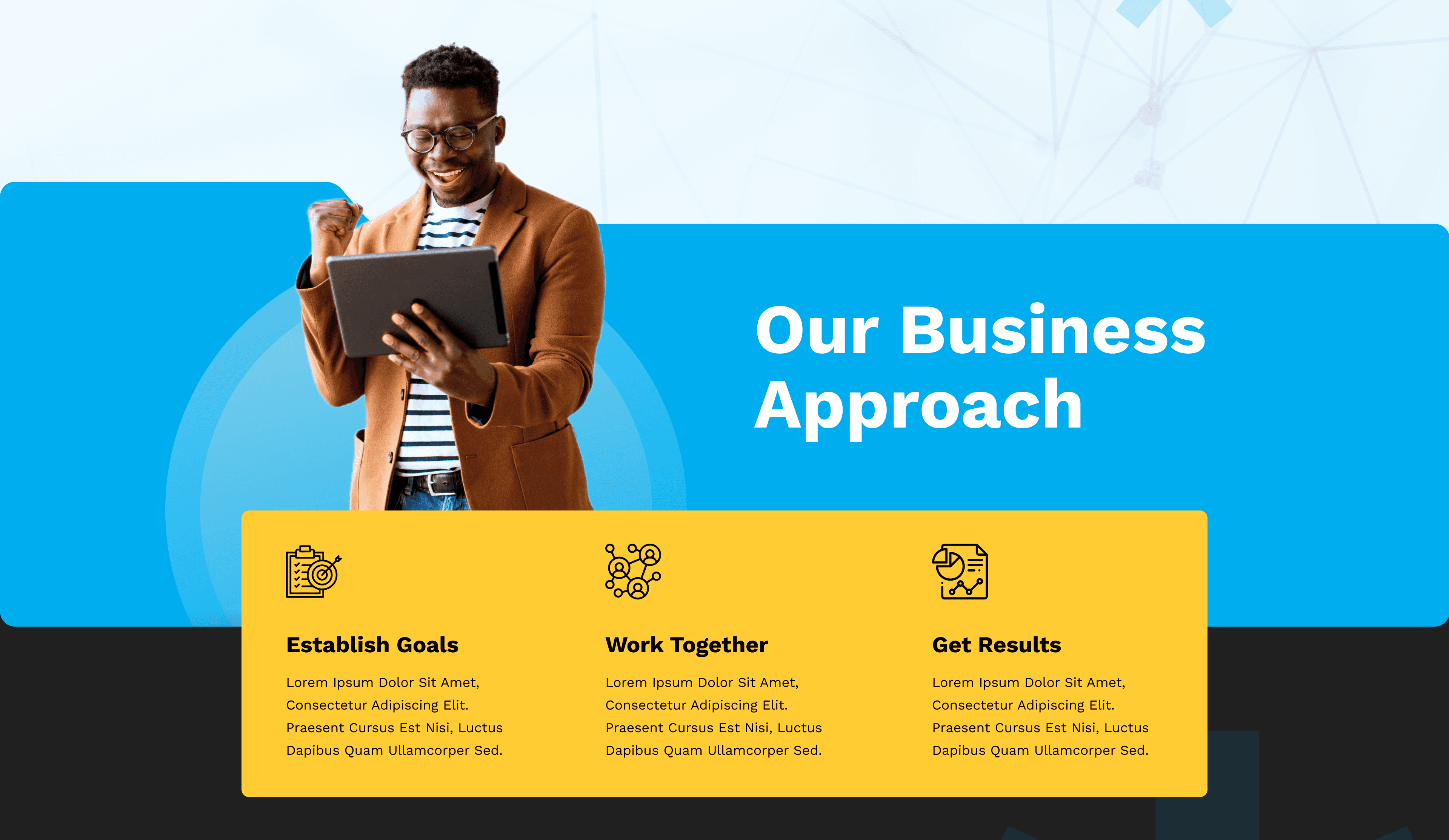
Section titled “Our Business Approach” simplifies the offering in three steps: Establish Goals, Work Together, Get Results.
Visually clean and emotionally reassuring—great for last-stage conversion nudges.
10. Footer with Utility Links and Branding
Full footer includes navigation, branding, and contact links with clear separation.
Chat icon adds interactive support availability, reinforcing user-centricity.



Conclusion
We thoughtfully designed to showcase expertise in SEO and digital marketing, while strategically guiding users toward conversion-focused actions like booking consultations.